QI Learning Center: Putting Your Run Charts to Work for You
- Details
- Last Updated on Tuesday, 07 April 2015 21:38
By: Kori Flower, MD, MPH, Senior Improvement Advisor, CPHQ
 So you’ve established an aim, selected at least one measure that will help you track your progress toward that aim, and your team is testing changes that you hope will lead to improvement. How will you show whether or not those changes are actually leading to improvement? Run charts are a simple but effective tool for visually displaying your measures over time. To create your own run charts, simply use the line graph option in Excel, or a similar program, displaying time on the horizontal axis and your measure on the vertical axis.
A few tips for visual display will help your run charts achieve maximum visual impact and facilitate interpretation. Ideally, a run chart has a ratio of about 5:3 horizontally to vertically, so it is longer horizontally than vertically, and conveys a more useful sense of change over time. In creating the vertical axis for your run chart, it is useful to consider the range of potential values and set the range so that the expected values lie within the middle third of the graph. An exception to this is when the graph needs to include zero. Consider how differently the following graphs might be interpreted:
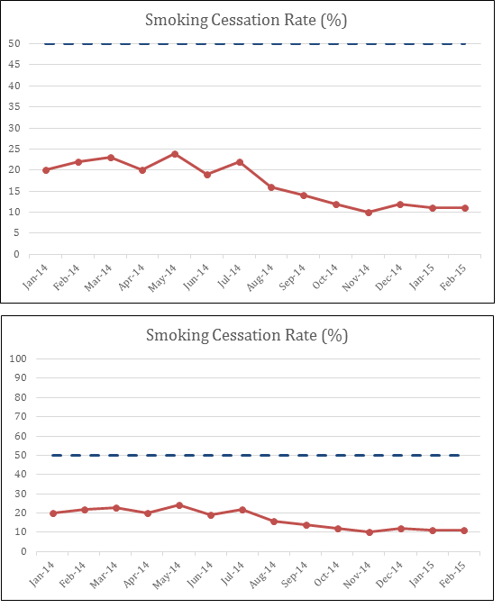
The same data are displayed on both graphs, but the impressive appearing decline in smoking cessation seen on the first graph is barely visible on the second graph, once the full range of values is displayed on the vertical axis.
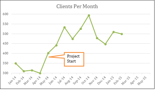
Another aspect of run charts to consider is the horizontal axis. In the run charts above, blank white space remains on the right hand side for future values. This clearly conveys the potential for future data points. Similarly, it is often helpful to add past data points, if available, to your run chart from before the start of your improvement project. This can be enormously helpful in separating the “signal” of true improvement from the “noise” of random variation. Based on the following run chart you might conclude at this point that there is not yet improvement:
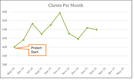
However, this improvement team had collected data prior to their improvement project, and adding previous data points would lead to a very different conclusion, and makes it clear that this measure had increased since the project start.
Run charts are most useful when they tell as complete a story as possible. To help tell that story, your team can consider adding features such as annotations (shown above), to indicate significant moments such as project start and other events, such as tests of change. Another helpful feature is goal lines, shown in the first two run charts as dashed blue lines. Displaying goal lines on your run charts can serve as a visual reminder for the team of the numeric goals of the project and the progress toward those goals. A median line can also be added so that you can apply run chart rules, which can help to differentiate random background variation in your data from nonrandom changes, such as changes due to improvement. Four run chart rules that you can apply to identify nonrandom change are when there are:”
- Six data points above or below the median
- Five or more data points going up or going down
- Too many or too few runs (see references for tables to determine this)
- An astronomical data point, which is usually a visually obvious outlier
Generally, you will need seven or more time points on your run chart before you will be able to apply these run chart rules and it is easiest to apply them if you have baseline data to establish a median line
Once you have optimized your visual display and analyzed your run charts, it’s time to display them! This is worth doing even at the beginning of a project with just two time points, because it conveys the expectation that data will be shared regularly, and fuels curiosity about seeing run charts in the future. Posting run charts in a public location is a great way to get everyone thinking and talking about your QI work. Large wall posters in a hallway can work well, but small, easily printed sheets that can be hung in a lunch or break room—or even the restroom—are also good options. For some organizations, a regularly scheduled email for sending run charts to all staff is a good option. Finally, choosing some highlights from the run charts to share with senior leadership regularly is a great way to draw attention to your efforts and promote support for your improvement project. However you choose to share your run charts, share frequently and widely, ask others to think about them with you, and use them as motivation for further change, and ultimately, for sustaining your improvements.
Interested in learning more? Try The Health Care Data Guide: Learning from Data for Improvement by Lloyd Provost and Sandra Murray, which contains a wealth of detailed information about run chart interpretation, and served as inspiration and reference for this piece.

